Pastel pencil tutorial for beginners
Before you put pencil to paper, let's look at what type of paper we will use for this pastel pencil tutorial.
The pastel pigment used in pencils is harder than the soft pastels used for centuries by artists. It is cleaner to handle and capable of a sharp edge or point for details. It still needs a similar type of paper to that used for soft pastels, as the pigment needs a surface able to grip and hold the dry powder.
Suitable papers are usually quite soft and have a rough surface. Another option is a sanded paper which is able to hold the pigment in a tight embrace and is even better at holding more colour.
For the purpose of this introduction we will be using a pastel paper with a slight grain to it made by Fabriano and called ‘Tiziano’.
There are dozens of papers of a similar type so there is no need to spend time and money searching for this particular paper to experiment with. It just happens to be the top piece of pastel paper in my store cupboard !
You will see it is coloured. Many pastel papers are coloured and you will often see packs sold in colour sets. Using a coloured paper provides an instant background as well as providing an overall harmony to your picture. This paper has a slightly ribbed surface.
 Tiziano paper for pastels
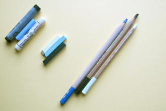
In the second picture above, you will see a trio of soft pastel sticks, still mostly in their original wrappers, in the middle a trio of hard pastel sticks as manufactured by Caran d’Ache, and thirdly a trio of Caran d’Ache pastel pencils - more or less the same colours.
Let's test some pastel pencils!
Let us have a quick look at how the colour goes down on the paper and what we can do with it.
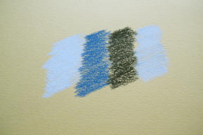
The first image is the dry pastel from the pencil laid down on the dark cream paper. Note how the ribbing of the paper shows the underlying colour through where the pastel has ‘missed’ - this is most obvious on the darker colour.
When you want a dark colour in your image, it does no harm to lay down a dark foundation, and similarly when you will be wanting a white in the final picture, a white foundation will protect the surface and enable you to get back to white later.
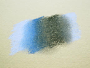
This slightly closer up photo, shows the effect of blending the edges where the colours meet, with the dry end of a finger.
This is just the foundation stage and we will be able to apply many layers of colour over these first coats.
See how the addition of another layer has intensified the colours.
The black is quite dense - even over the white. The blue shades from light at the edges to darker blue when it is over the black, and the white produces shades of grey at the centre.
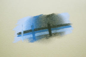
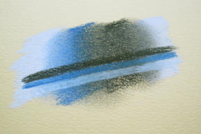
My final photo shows the effect of adding a further set of three vertical lines of colour in the same direction as the original blocks.
Note how the white goes over the black line from the previous stage. Some colour travels with the white and makes it slightly grey, but the dense black has been covered.
The blue in the centre returns the area to blue but picks up a little of the black in transit.
The final line of black is now very dense and the paper grain virtually filled.
What I am showing in the test above, is the way the pastel - even the relatively hard pastel of the sticks and pencils - will blend and cover. It is an OPAQUE media. Given half a chance it will totally cover the colour underneath. Quite different to the transparency of wax type pencils and watercolour pencils.
In a moment we will look at a worked example of a little still life subject and see how the working of pastel pencils develops a picture.
But what happens if I go wrong?
Good question, and one best looked at before we begin, so that we have the re-assurance and knowledge that disasters can be (mostly) put right if caught in time.
As pastel builds up on the working surface it becomes more and more difficult to correct, so any corrections need to be done whilst there is still some grain of the paper or card surface to go back to. Dense pastel which has built up moves easily from side to side, but is very difficult to lift (see bristle brush - below).
The tools of the correction trade are as follows :
Blue tac/White tack. Blue tac on its own tends to be on the stiff side and white tack tends to be softer and stickier. A blend of the two makes an ideal lifting medium for pastel and a blob of the mixture kept to hand is invaluable.
Store it in between the fold of a small sheet of thick plastic or in a pot which you can get your fingers into to excavate it.
The mixture has a habit of ‘flowing’ if left for some time, so keep an eye on it. I keep a bit stuck to the top of my easel and it is fairly well behaved there and doesn’t wander far.
This sticky mixture can be moulded into an exact shape to lift specific areas of pastel, and will lift pastel pigment from most surfaces and absorb the dust.
It also keeps your hands clean when you have been indulging in mixing the colours with your fingers. Just keep folding it in on itself to reveal a new sticky surface. The pale blue mixture will get greyer and greyer over the years but will still work well. I have a blob that is around 8 years old.
I prefer the tack mixture to the commercial kneaded erasers, though it has to be said that the Faber-Castell kneaded eraser is equally as good. It works out somewhat dearer to buy but may be easier to find than the elusive UHU White tack.
Another excellent pastel remover is the ‘Magic sponge’ sold by chain stores like Aldi for general cleaning. The sponge is white and made from a very dense foam which can be easily cut into strips. It is very inexpensive and is also said to work well removing watercolour from paper.
A craft knife can also be used to scrape away pigment, though care is needed that you don’t damage the working surface and ruin the grain of the paper for working the correction.
I have seen books quote using a ball of kneaded fresh bread as a good correction material that will lift colour from the surface, but I haven’t tried it.
I do keep a short bristle brush handy as this can remove some of the upper layers of pigment when the pastel gets too built up.
Can we start now?
Definitely!
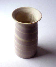
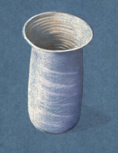
Let us look at a little vase as a subject for this pastel pencil tutorial. The pot has a matt surface and delicate colouring so is very suitable to show the benefits of pastel pencil for both still life and portraiture.
As Pastel is an opaque medium, I will also be working on a coloured background, merely to show how well it works and to point up the difference between pastel pencils and the more transparent wax and oil based coloured pencils.
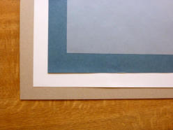
My paper is a blue 160gsm Ingres pastel paper and I am using it on the smoother side rather than the ribbed one.
I have the paper taped down to a drawing board so that the paper stays absolutely flat, and there is a sheet of smooth card underneath the working paper so that any imperfections in the board surface are not carried through to the picture.
I also have a sheet of thin paper on the top and secured along one edge, so that when I stop work, the covering paper can be brought over the artwork to protect it from damage. It all sounds a bit of a fiddle, I know, but you will see the benefits as you work.
Here we have the layers - desk at the bottom, then the drawing board, then smooth white card, then the blue working paper, finally the thin paper on top to provide protection.
The board is A3 size ( for those in the rest of the world that is 16.5 inches by 11.75 inches approx ), so the image I will work will be quite big for a little pot. That will scan well, though, for showing you the working process.
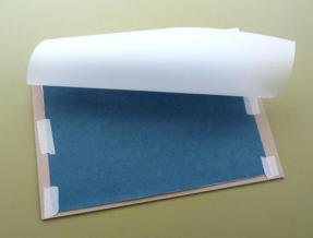
And the final board looks like this. It is not necessary to tape all round the working paper - we are not stretching it.
The top is taped straight across and the sides just have enough to stop the paper moving about.The white card is just visible underneath, and the protective layer is folded back.
You can use a little bit of tape on the bottom edge to close down the top protection if you need to take the work somewhere to work on it.
The protective layer can be ordinary white paper, Glassine anti static paper or even brown paper- it is just that I had tracing paper the right size, to hand.
I have drawn out the image using a limited number of colours.
At this stage I am just putting down the basis of the colour, so I have reserved white for the areas that are light, and the darker colours for the shadowed areas that I want to keep more subdued.
The colours chosen are White, Raw Umber (for the mid brown), and sepia (for the darks - a very useful colour). These three provide the basis for the inside of the vase.
The Sepia used for drawing provides the dark limit of the side. The colours for the outside of the vase are White for the lighter side and a combination of Purple and Magenta for the dark side. The darkest part of the shadow has been marked in using sepia for now.
Notice that all the strokes follow the shape of the vase surface as we see it. When shading in a curve, always turn the work surface (and the reference) so that you're drawing hand moves with a normal wrist action and draws a natural curve. It is much easier to move the paper around than to try to draw a curve in an unnatural way.
Although this example is quite a large picture (the image of the subject is 8 inches high), it took just over half an hour to get to this point.
This pastel pencil tutorial won't take very long to complete.
Using the larger pastel sticks or blocks would have been even quicker, but the detail would have been more difficult to achieve.
When we work in wax and oil based coloured pencils, we lay down a base coat of colour in the same way and build upon it. The initial base of the colour - the first layer - is vitally important in setting the tone and basic colour of the final layers as the wax based pencil goes down in semi transparent layers and each layer builds upon the previous layers.
With pastel pencils we still need those first layers to set the tonal and colour balance. But rather than just building layers, like lines of bricks in a wall, pastel also involves the mixing of the pigment on the paper. We need that early foundation to provide the palette that the detail is worked into.
A really dark area needs a really dark base. A really light area needs a base of white. Mid tones are less of a problem as added white will always lighten, and added darker colours will always darken
I have worked some heavier layers in with a Flesh coloured pastel to bring up the lighter areas. That top edge of the vase looks a little wobbly at the moment but it should come right as the detail is built up.
Notice that I have put some heavy vertical layers of light pastel down the left hand outside and also built up the right hand inside quite a lot.
Heavy use of a pastel pencil soon wears down the point.
So you need to be aware of three essentials -
1. Keep the point at a reasonable length and sharpen up the pencil regularly to avoid working with a stump of pigment.
2. Keep turning the pencil to get a fresh edge to the point, that flat point is very useful to get a crisp edge on a line. You will build your own point as you work, so it is not necessary to sharpen up the actual point with a knife until you get to the later stages of the work.
3. A piece of sandpaper is useful to tailor a point to an exact shape.

Now we come to the big difference between coloured pencil and pastel pencil.
No additional pastel has been added to this image.
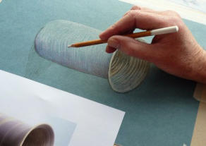
The difference you see is that I have applied a clean forefinger to the pastel surface and rubbed it in - pressing the powdery material into the paper as I go.
There are those who recommend using a paper ‘torchon’ or a silicone tool to do the rubbing in, and these are very helpful in small detailed areas and small pictures where the finger does not easily fit.
One benefit of using the finger is that the dry skin holds a certain amount of powder which it picks up and blends. CARE should be taken not to try this method with greasy or oily skin as the rubbing in process will not work as well and the pastel will absorb the grease and may permanently mark the picture.
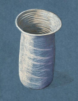
The next step is to introduce some more colour to the right hand outside and work back into the lighter left hand side.
I will also sort out that wobble in the top edge.
Here you can see that I have added French Grey to the right hand side - all the way down to the bottom.
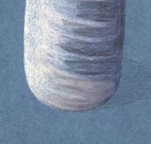
Look closely at the base where I have now gone back in with the Flesh pastel and Shaded OVER the French Grey. The Flesh pastel picks up and merges the colours.
I can repeat this process over and over working from opposite sides until the shading is evenly graded from left to right.
I can then repeat the process inside the vase and develop those ribs in the pottery and finally put in the sharp and soft edges for shadows and sharpen up the top rim.
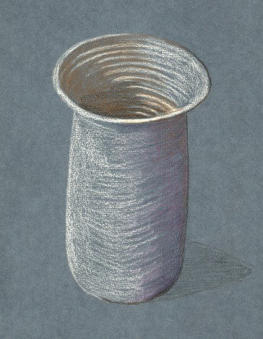
The results of our pastel pencil tutorial!
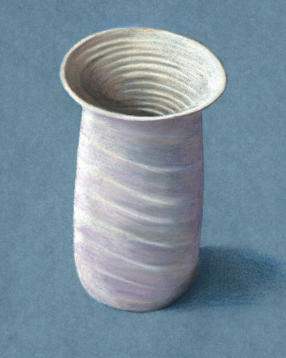
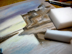
You will see that I have completed the shadow at the foot of the vase. This had a first shading with Sepia for the darkest area of shadow, and then a layer of dark blue over the top extending over a wider area and then rubbed in.
Remember that shadowed areas are not black or grey (unless they are on a grey surface).
Shadow is a darker and colder shade of the body colour of the area when seen in sunlight, toned down to a slightly cooler version.
I have sharpened up the edges against the blue paper with a pastel that more or less matches the blue of the paper. This I have worked in and ‘lost’ into the paper using a silicone tipped colour shaper tool which enables me to get very close to an edge.
If I were going to frame this up as a finished work, I would do some more to the inside where the darker shadow is a little too dark, but in real life, the ‘finished’ picture you see here looks quite three dimensional.
Possibly not something that anyone would want to buy, but that isn’t the point in this beginners pastel pencil tutorial.
I hope you have picked up some tips along the way, or even better will attempt it yourself.
You might like these
Pastel pencils basics
pastel pencils - Explore the distinct characteristics that set them apart from traditional colored pencils and learn how to use them in your artwork
Still Life Objects to Draw That Capture Sentiment and Emotion
Discover personal still life objects to draw. This list of emotional suggestions will inspire you to draw more than fruit and flowers. Start sketching today!
Still life pencil drawing - points to consider when composing
Still life pencil drawing - basic concepts to keep in mind when planning your realistic piece of artwork, including negative space


You might like these
Simple coloured pencil still life tutorial of a bowl of fruit
Beginners coloured pencil still life tutorial - learn the strokes and unique layering technique used in coloured pencil artworks
Pastel pencils basics
pastel pencils - Explore the distinct characteristics that set them apart from traditional colored pencils and learn how to use them in your artwork
- Home
- Step by Step Tutorials
- Pastel pencil tutorial
Would you like our occasional newsletter?
Home | About Us | Contact Us | Privacy Policy
Copyright Peter Weatherill and Carol Leather - 2009-2024